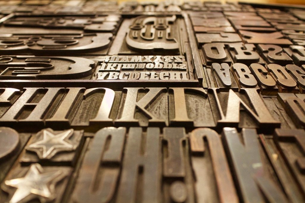
Typography is the process of arranging a type in a pleasing manner to be able to relay a message. A typographer is a skilled artist who has specialized in the selection and arrangement of type images. Text on a page/ pages or in a book is described in Graphic Design as Typefaces or Fonts. A typeface or font is a particular style of one set of letters, numbers and punctuation marks.
There are hundreds of typefaces with different sizes, variations, and characteristics e.g. italics, bold, heavy, regular, narrow, rounded, display, compressed, light, condensed, extended etc. Some of the typefaces quickly draw the attention of onlookers because of their boldness while others express the feeling of movement and instability. The graphic artist has to understand the distinctive features of all the typefaces before he can effectively select the most suitable one for the execution of a particular product.
The selection of type for Graphic Communication is based on factors such as the type of information, the target audience, legibility, readability, and appropriateness.
1. The type of information
This refers to the kind of message that is to be relayed to the audience. This could be health issues, religious issues, political issues, etc. The graphic artist must know the information to be delivered so that he selects the appropriate font that can best carry the message to the general public. For example, billboards, banners etc. hinged along the major streets must carry heavy, display or extra bold fonts for legibility and readability.
2. The target audience
This is the people the message is to be sent. The graphic artist has to know the sex, age range, tastes or choices, cultural background and location so that he would select the typeface and type size that can effectively send the message. For example, if the graphic artist is selecting a typeface for a book for nursery pupil, he would not select the script, italic or serif type. This is because it may not be legible to the children who are now learning the letters of the alphabets. The best selection of typeface should be a sans serif typeface which is bold with a type size of about 18-20 points. This choice would be definitely different if the target audience were adults or teenagers.
3. Legibility
This refers to how easy the typeface to be selected can be seen and recognized at a distance. This should be very important to the graphic artist because the main objective of our work is to communicate effectively to the people. Therefore, before he selects a particular kind of typeface he should ask himself this important question: ‘Will my targeted audience be able to see and understand the message I am sending to them easily?’ If the selected font style answers it correctly in the affirmative then the choice is good.
4. Readability
This deals with how easy the target audience can combine the letters of the type into meaningful words and sentences as well as trying to decipher the content. Readability concerns itself with how fast the onlooker reads and digests the message portrayed by the graphic artist. It looks at the unity created by the combination of the individual letters into communicable symbols. The graphic artist must select a type that is easily readable.
5. Appropriateness
This is how well the selected typeface harmonizes with the message to be conveyed to the general public. The selected type must also be appropriate to the preferences of the targeted audience.